The data iceberg: why advanced analytics are the only way to understand a space
If it hasn’t been said before, we’d like to say it now: space management is like an iceberg.
What you see on the surface of how a space is managed is often just that - surface-level data. It doesn’t lend itself to much insight beyond the obvious facts on how many people utilise a space, book meetings or bring a visitor in for the day.
Much like the tip of this metaphorical iceberg, the granular detail needed to understand the true potential of space is stored underneath: it’s tucked away in changing membership plans, retention metrics, age-based data on space usage and what time of day a particular resource is most requested. Let’s explore how to tap into this data and gather insights that can:
Improve retention
Increase revenue
Target the right audience
Are you asking the right questions?
At Nexudus, we believe that the process of gathering the right data must begin with asking the right questions.
How does the time of a booking affect the length of meetings or the size of the booked resource?
What is the mean price of a booking depending on the type of user that is using the resource?
How has the ratio between the average number of members per resource in my workspace (and in the wider community) evolved?
Questions like these, which encourage coworking spaces and their owners/ operators to delve into granular data, usually result in better performance insights.
Similarly, looking beyond the more obvious metrics when running a report can help admins determine statistically significant changes in resource consumption patterns, the evolution of the average price of a booking and even how resources are used across different locations within a coworking space provider’s network.
The Data Iceberg and Why It Matters.
Insight-driven reporting tools.
This is the next big arrow in your quiver, that we recommend space providers of all sizes should utilise when gathering data points for insight-led business decisions.
Having an analytics tool built into your space management software can help pull parameters, patterns and data points from behind the scenes, while you focus on daily operations. When it comes time to put together a report, imagine logging into your reporting tool and finding that already done for you.
We have long believed that creating a central repository for your data makes it much easier to compare, contrast, identify recurring trends and refine data points when it comes time to optimise your offering, determine revenue growth strategies or simply when you want to modify a popular plan.
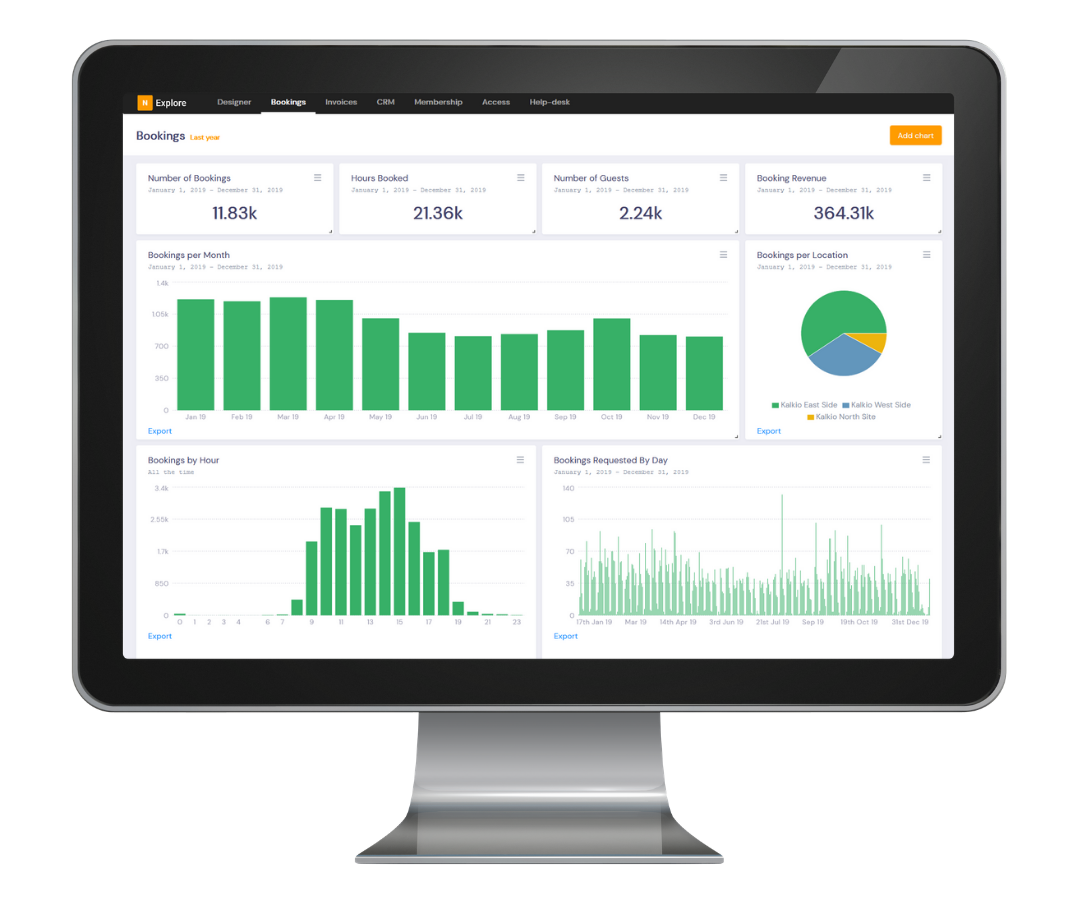
Having the data in one place, preferably in an integrated analytics tool, can show at-a-glance information on bookings, billings, CRM, memberships, access, help-desk, churn, surveys and many other records.
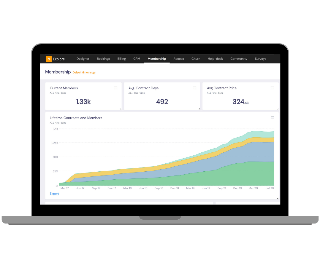
Let’s get visual.
The next big step in utilising the data you gather is being able to visualise it clearly. Picture this: you build a query into your analytics tool, such as:
‘Find types of membership plans issued since December 2023 to new customers, including customer details for each’.
And up pops a chart that plots plans (and their prices) against the new memberships.
Now that you’ve got your iceberg tip within view, you want to understand how deep this goes, and how much insight can be gathered from it.
You follow up with three additional queries:
‘Determine how many bookings have been made, by the hour, for these memberships, since December 2023.’
‘Show how these bookings are divided up amongst spaces across the portfolio’
‘Find the total booking revenue for these bookings since December 2023’
When all your data is in one place, having a collected visual guide for each of your data queries can help reveal valuable insights at a glance.
A guide to help you on your data journey.
Nearly a decade ago, McKinsey Global determined that data-driven organisations are 23 times more likely to acquire customers, six times as likely to retain customers, and 19 times as likely to be profitable as a result.
FlexSpace Observatory analyses bespoke data points from millions of usage patterns to show you how data can deliver savings, boost revenue and delight customers. Discover why:
Offering a team price on dedicated and hot desk rates can ensure a 16% longer tenure
Attracting members above the age of 45+ can ensure a 20% longer tenure
The pandemic has accelerated the entry of new customers into the sector from a traditional model
To compare how your space is performing against other coworking and flexible workspaces across the UK, US and parts of Europe, and to determine how member tenure patterns shape workspaces around the world, download your free copy of FlexSpace’s report today.
At Nexudus, we’re passionately building technology that provides space owners and operators with fully customisable, easy-to-integrate digital solutions for their spaces, across coworking, commercial real estate, hospitality and beyond. Since 2012, our award-winning technology has helped workspace owners and operators in over 90 countries digitally transform their spaces, manage them more efficiently, provide exceptional customer experiences and gather advanced analytics for better decision-making.
Related stories
Top 5 Must-Have Meeting Room Technologies for Your Coworking Space
Discover the latest trends in office meeting room technology and design. From smart booking systems to high-speed Wi-Fi, learn how to create dynamic and inclusive meeting spaces that enhance collaboration and productivity in the era of hybrid work.
5 Ways a Coworking Software Can Supercharge Your Members' Experience
Discover how coworking software can transform your coworking space. Learn 5 key ways it boosts member satisfaction and productivity. Find out more now!
Automating the every day: turn any space into a smart space
Like most things in business, transforming your space into a smart one requires a strategic approach. Let's explore.
Designing for tomorrow: how technology creates meaningful places
In part two of our placemaking series, we're exploring the integral role of technology in placemaking. Learn how to use technology to unlock placemaking's highest potential.
Friend Not Foe: The AI Advantage in Workspace Management
Discover how AI transforms workspace management with Nexudus, enhancing operations and empowering operators. Learn more
Tech-enabled spaces: Managing hybrid communities in coliving spaces
To bring people into mixed-use spaces, the company’s brand values and culture must be visible to a large pool of people. Technology supports this by enabling businesses to share their message with a global audience
Integrations: Essentials, nice-to-haves and how to build your own
From access control to payments and WiFi check-ins for streamlined community management - discover what we consider the most important integrations for your space.
Software integrations: a flexible workspace operator's best friend
If you haven't managed workspace software integrations of your own, we're here to walk you through the basics. This is part one of our integrations series.
Using actions, not words, to build a workspace community
Community is far too nuanced a concept to simply use checklists to create. It works much better in person, than on paper, and has to be designed as such.
Beyond coworking - How technology supports operators to maximise revenue streams
From dynamic pricing to flexible memberships and even virtual communities, technology can help space owners and operators supercharge their revenue streams. Here's how.